Rebuilding a remote uroflowmetry platform for a medtech company
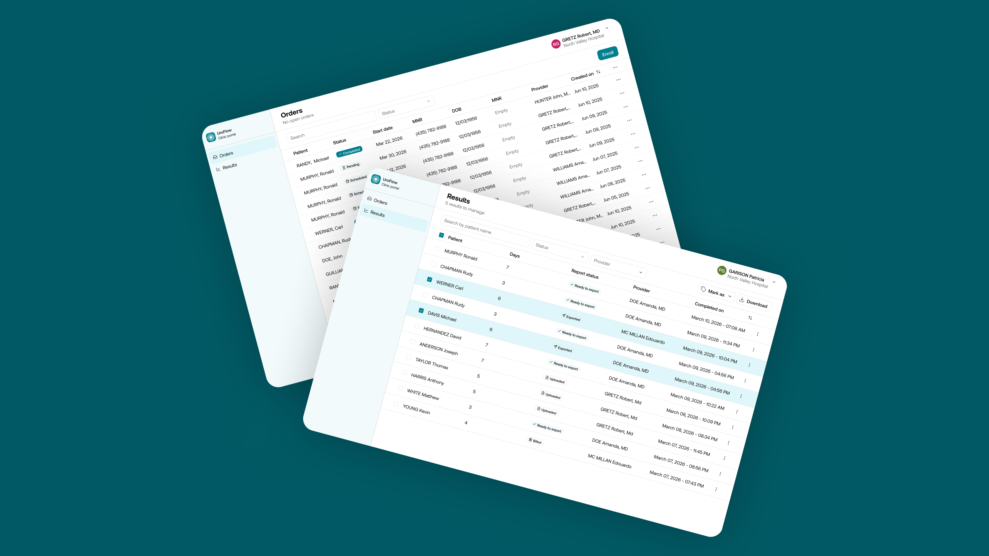
Uroflometry in US Clinics is a costly, time consuming procedure that does not always deliver the best data because it’s highly dependant on patient’s condition on the day it occures. UroFlow App lets patients record the sound of urination through on their phone for a 7 days test, at home, converting it into clinical data urologists use to assess prostate health. The ecosystem spans three products — a patient app, a clinic web portal, and a clinician mobile app. By the time I joined, it worked, but had grown without a unifying vision and presented serious ergonomic issues.
Design challenges
All 3 applications were built on old technologies and frontend was entirely custom. No design system meant heuristic violations and ergonomic inconsistencies as well as unoptimized development time.
Balancing an MVP mindset with product consistencyMoving fast and taking shortcuts to validate ideas quickly was essential for this start-up. Yet, ensuring scalability and covering for upcoming needs, without redoing the same work twice was also essential, furthermore as the product was already in production and drastic and regular changes could be destabilizing for existing users.
Designing for a less tech-savvy, older patient populationFor the Patient app in particular, UI needed to support an aging, sick population. Contrast, font and button sizes as well as worflows sometimes required adjustments compared to heuristics to cope with those specific user needs.
Reshaping an ecosystem that worked, but not by design
The product functioned, but had never been built against any UX standard — no design system, and ergonomic and heuristic violations scattered across all three apps.
I ran a full UX audit across the patient, clinic, and clinician apps point out systemic issues in the domain of heuristics, accessibility and information architecture. Following this first round, I then set up two dedicated design systems, based on existing ones to speed up implementation — Gluestack for the mobile apps and Shadcn/ui for the clinic web portal — to give each platform a consistent, standards-compliant foundation instead of patching individual screens one by one. New features were then designed and developped way faster and all apps gained in consistency.

Staying MVP without sacrificing scalability
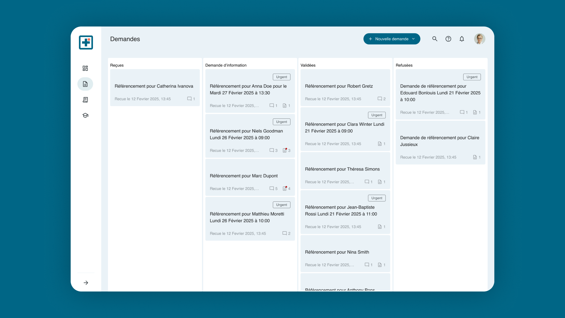
The team needed to keep testing ideas fast, but every shortcut risked being redone later or quietly breaking the experience for existing users. I addressed this by reworking the information architecture that will allow more sections to be added later in a logical, workflow oriented way.
I also redesigned the ordering flow and the way results were binded together to cover for upcoming order types, where not only one test but up to 4 would be prescribed to patient, allowing urologists to track success of a given medication or surgery along the time.
Digitalized communication with patients
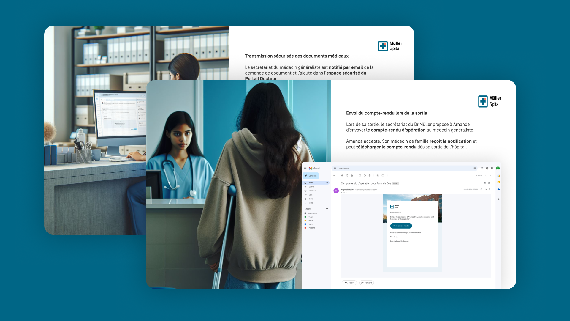
To improve patient experience and support administrative formalities, we reviewed communication channels. We mapped a set of notifications, reminders, online forms and surveys to be sent along treatment journey.
Reducing and anticipating administrative tasks, plus an on-purpose communication helps to reduce patient anxiety and enhances their overall experience.
Designing for older, potentially impaired patients under physical constraints
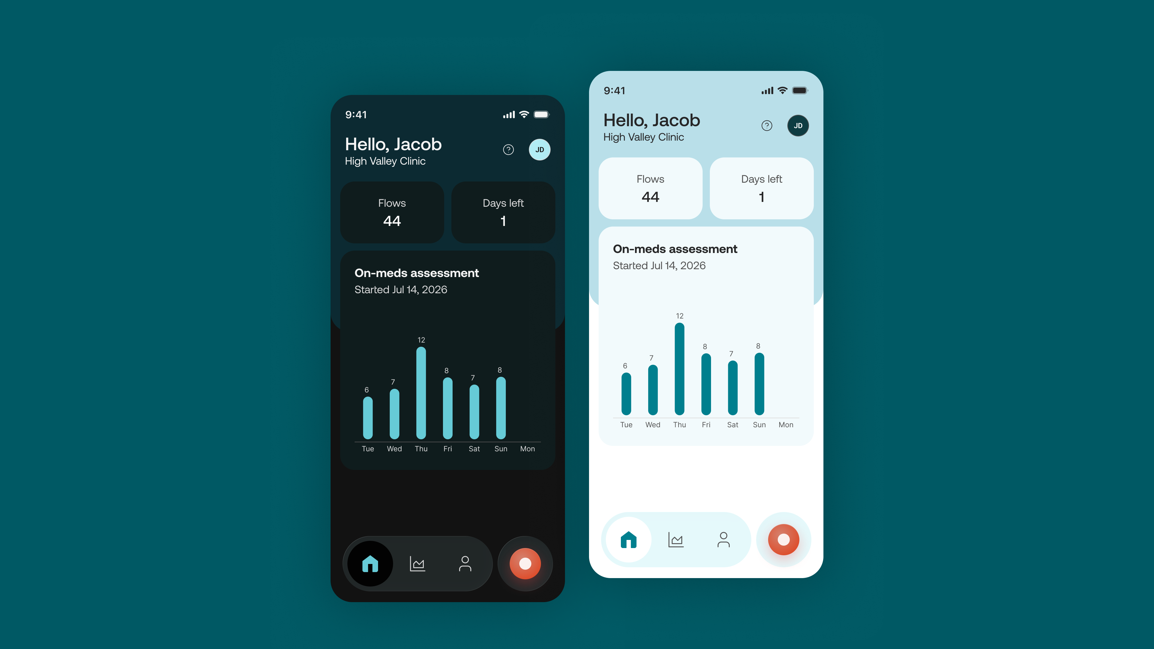
Prostate health mostly concerns an older population, some of whom live with impairments affecting sight or dexterity — both critical when interacting with a phone screen. On top of that, two constraints came directly from the physiology of the task itself: the urge to urinate can be sudden and hard to hold, meaning no instructions could be shown before recording — only after, which meant knowingly breaking a usability heuristic because the alternative simply wasn't compatible with the user's physical reality. Recordings also frequently happen at night, so a bright screen at 3am was a real usability (and comfort) issue — which is why I designed a dark mode for the patient app, treated as a core need rather than a cosmetic option.
Gallery